
Case study 03 · Brand System
Playhouse
A brand system for The Playhouse, a venue built as the weekend social destination for young people.
Overview
Playhouse needed a brand identity that felt like the space itself, a spot young people could show up to on a Friday night and instantly feel the energy of. The brief wasn't about looking premium or polished for its own sake; it was about capturing that specific feeling of weekend release, built into every part of the identity from the mark to the color system.
The challenge
A space built around fun and youth culture risks looking either too corporate (killing the vibe) or too chaotic (killing the trust). Playhouse needed an identity that could hold both, energetic enough to feel like the space it represents, but structured enough to actually function as a brand across signage, social, and merch.
The approach
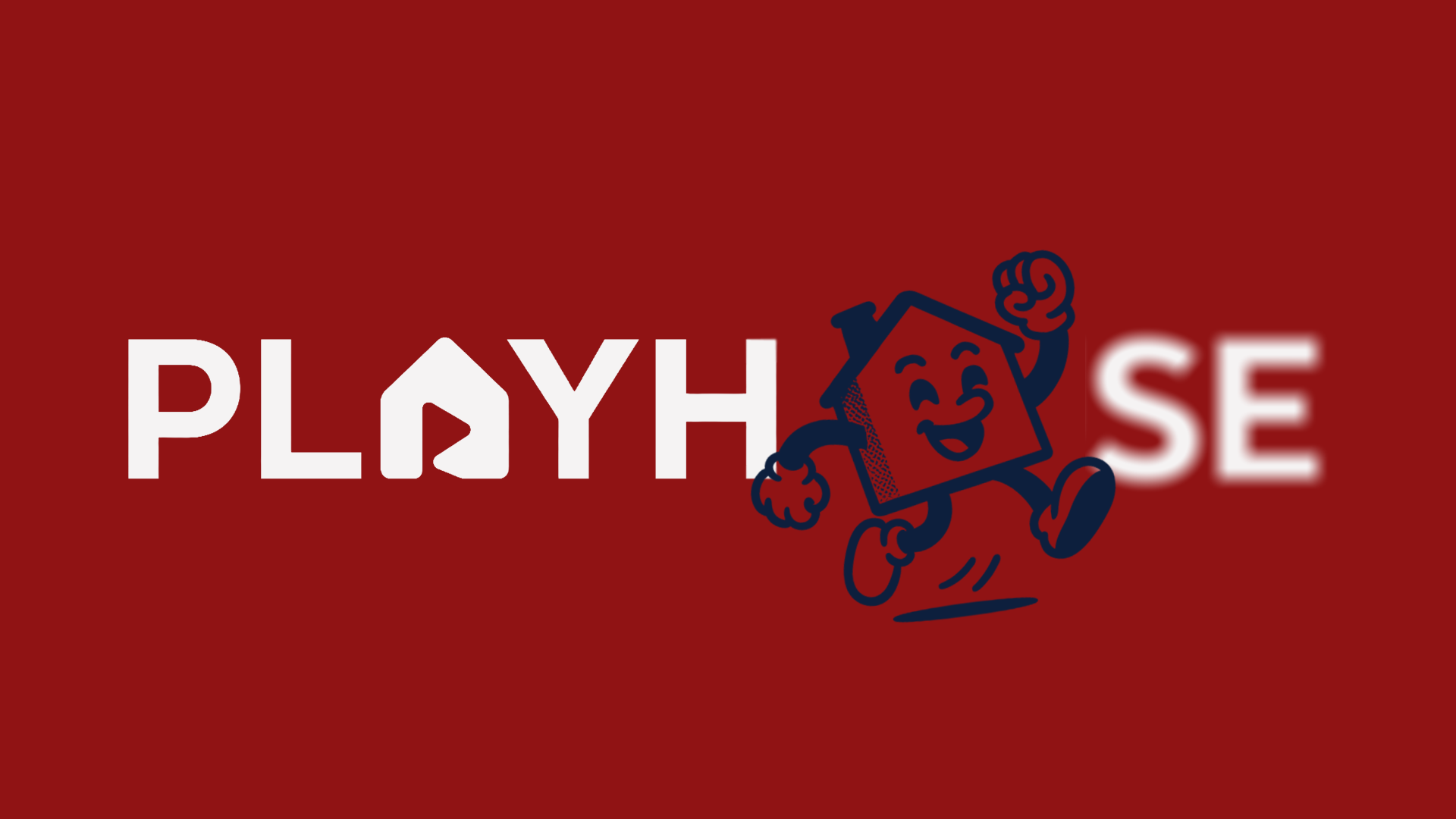
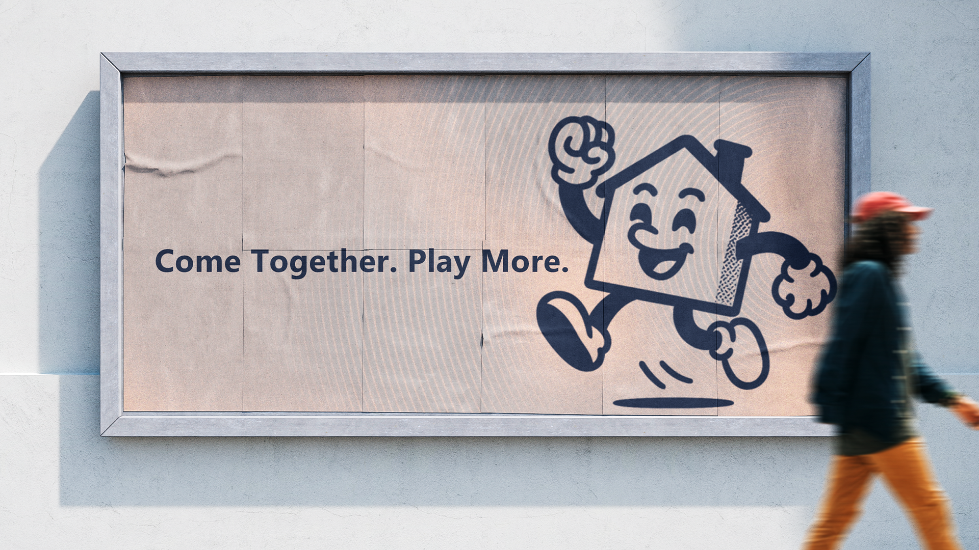
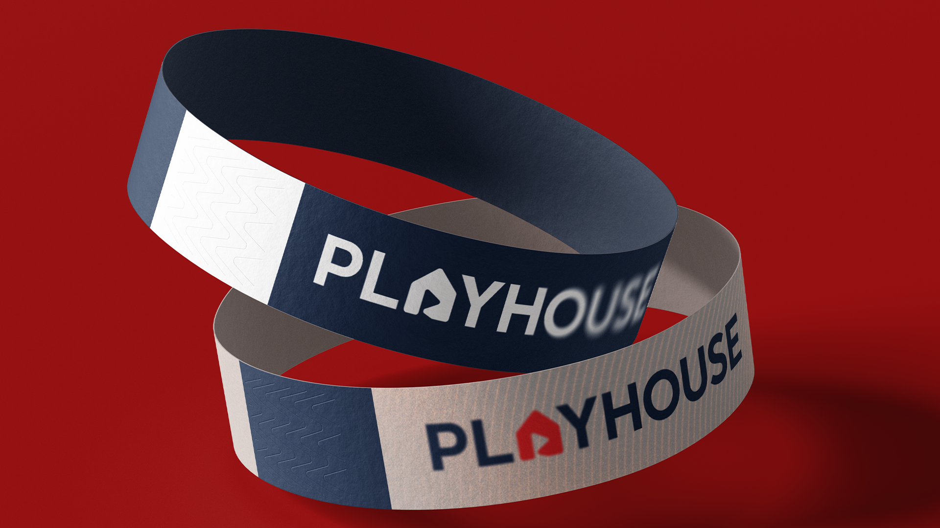
We built the identity around the feeling of the weekend itself bold, high-energy, unmistakably made for a young audience without tipping into gimmick territory. Every element, from the mark down to the color system, was designed to carry that same social, high-energy spirit consistently across every touchpoint the brand shows up on.
The outcome
The brand identity successfully captured the energetic and youthful spirit of the Playhouse, creating a cohesive visual language that resonated with the target audience. The identity has been effectively implemented across various touchpoints, reinforcing the brand's presence in the market.
Project gallery

Lets Work.
Lets create designs that are built to move people and made to last.
Start a project →