
Case study 04 · Packaging & Branding
Swish Drink
Shelf-ready packaging and branding built to stand out in a crowded category.
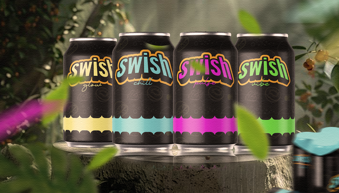
Overview
Swish Drink needed packaging that could hold its own on a crowded shelf — bold enough to catch the eye, but polished enough to feel premium at first glance.
The challenge
Swish Drink operated in a highly competitive market with numerous established players. The challenge was to create packaging that would stand out on the shelf while maintaining a premium feel.
The approach
We focused on creating a bold yet sophisticated visual identity that would resonate with the target audience. This involved extensive research into consumer behavior, competitor analysis, and brand positioning. The design process included developing a unique typography system, selecting a vibrant color palette, and creating compelling visual elements that would stand out on the shelf.
The outcome
The packaging design successfully captured the brand's essence and stood out in the competitive market. The bold visuals and premium feel have contributed to increased shelf visibility and consumer appeal.
Project gallery

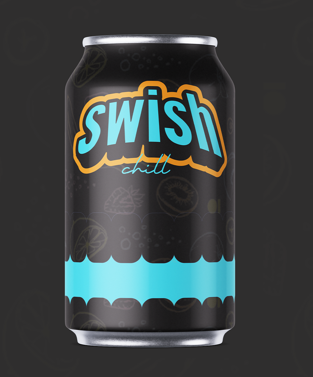
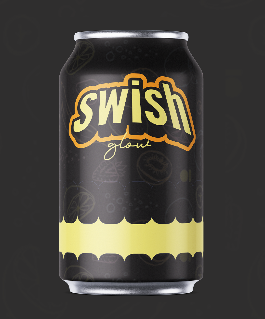
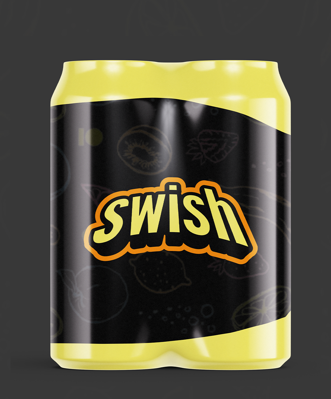
Lets Work.
Lets create designs that are built to move people and made to last.
Start a project →