
Case study 01 · Visual Identity
Sosika
A bold visual identity system built for a brand that wanted to feel unmistakably its own.
Overview
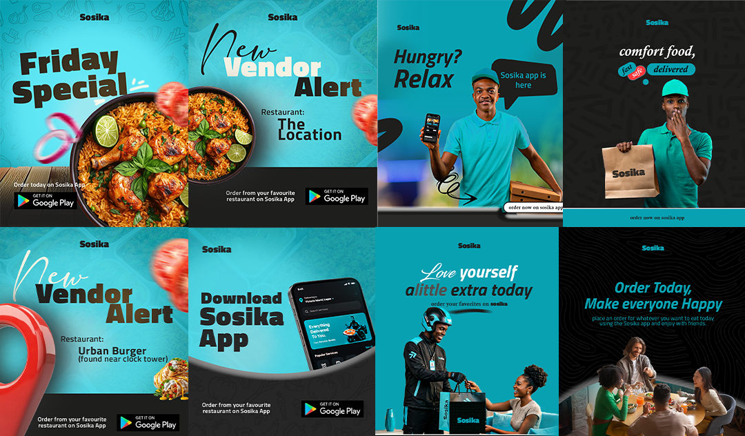
Sosika came to Madebyramad needing a visual identity that could carry across social, print, and product touchpoints without losing its edge. The brief called for something bold enough to stop the scroll, but flexible enough to hold up across every format the brand would actually use day to day.
The challenge
The brand had strong instincts about tone but no visual system to back it up. Every post, flyer, and asset was being designed from scratch, with no consistency holding it together.
The approach
We started with the MADE framework — mapping out the brand's audience and voice in the Meet phase, before landing on a direction in Align. From there we built out a full visual system: color palette, type pairing, and a flexible template kit the team could run with long after handoff.
The outcome
Sosika now has a cohesive visual identity that consistently represents the brand across all touchpoints, enabling more efficient design processes and a stronger market presence.
Project gallery


Lets Work.
Lets create designs that are built to move people and made to last.
Start a project →