
Case study 02 · Visual Identity
Munchava
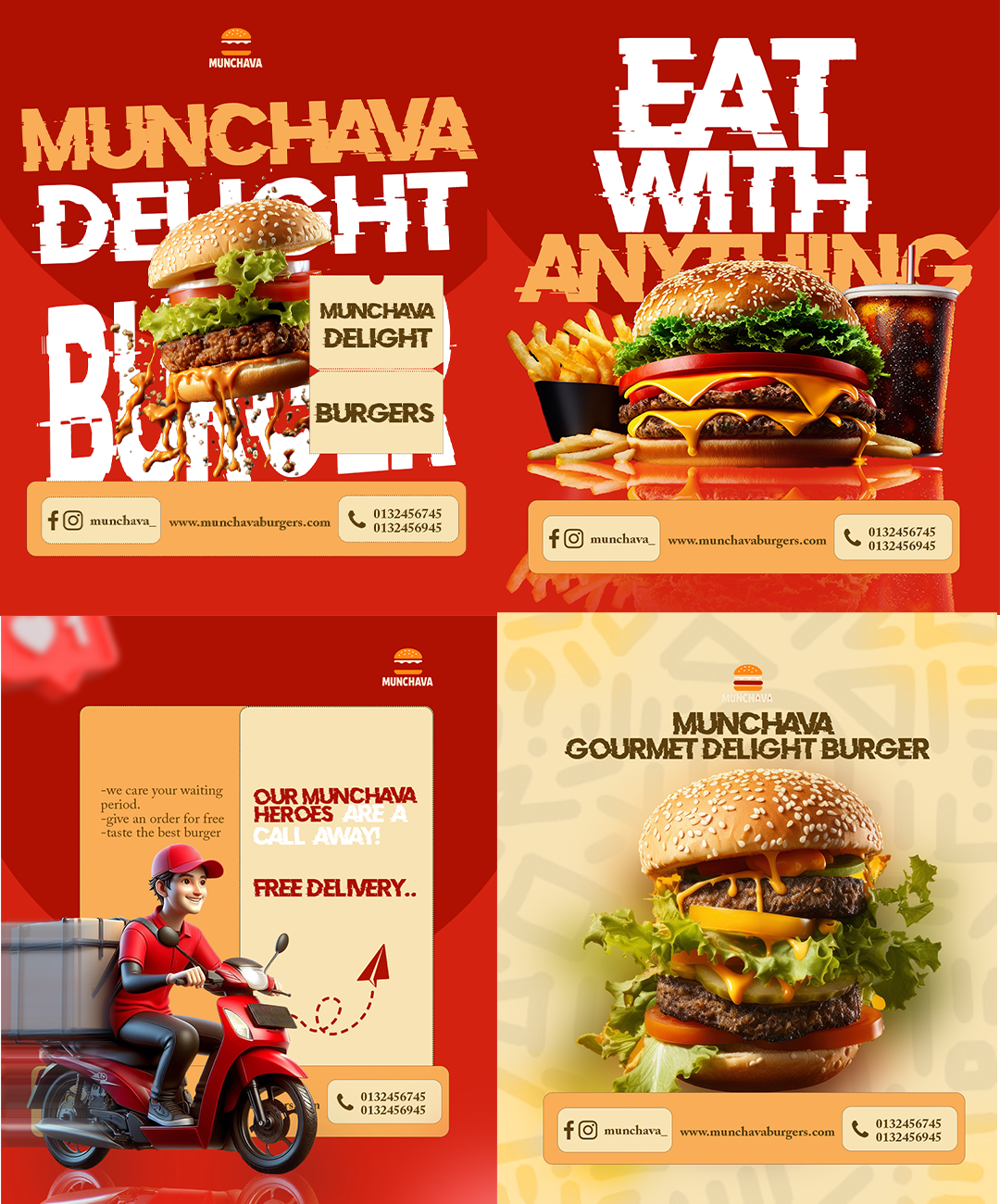
A full visual identity for a modern food brand called Munchava.
Overview
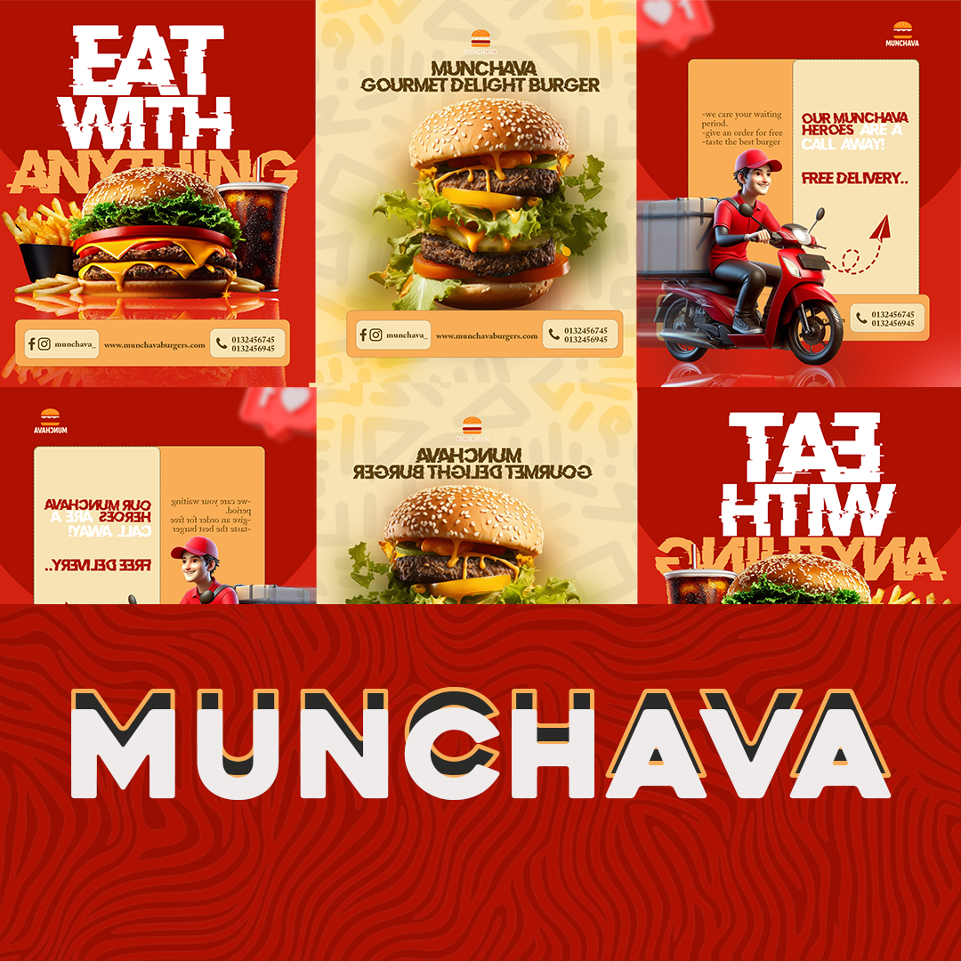
Munchava needed visuals that felt as inviting as the product itself. The goal was a system that could scale from packaging to social to signage, all while staying instantly recognizable.
The challenge
With multiple product lines under one name, the brand risked feeling scattered, each item looking like it belonged to a different company.
The approach
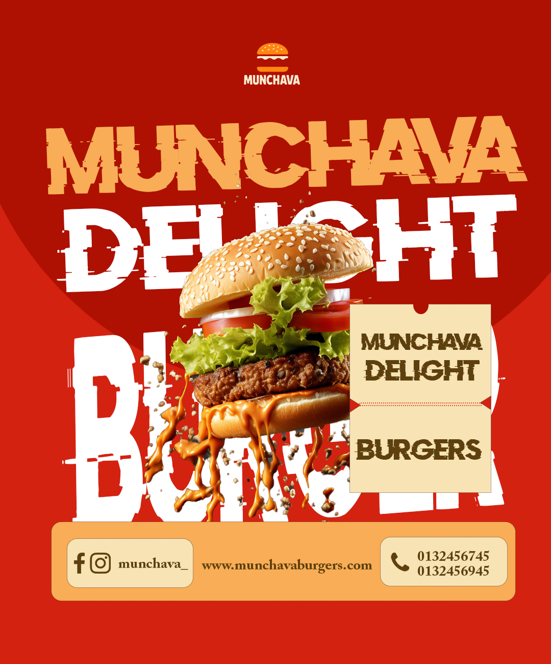
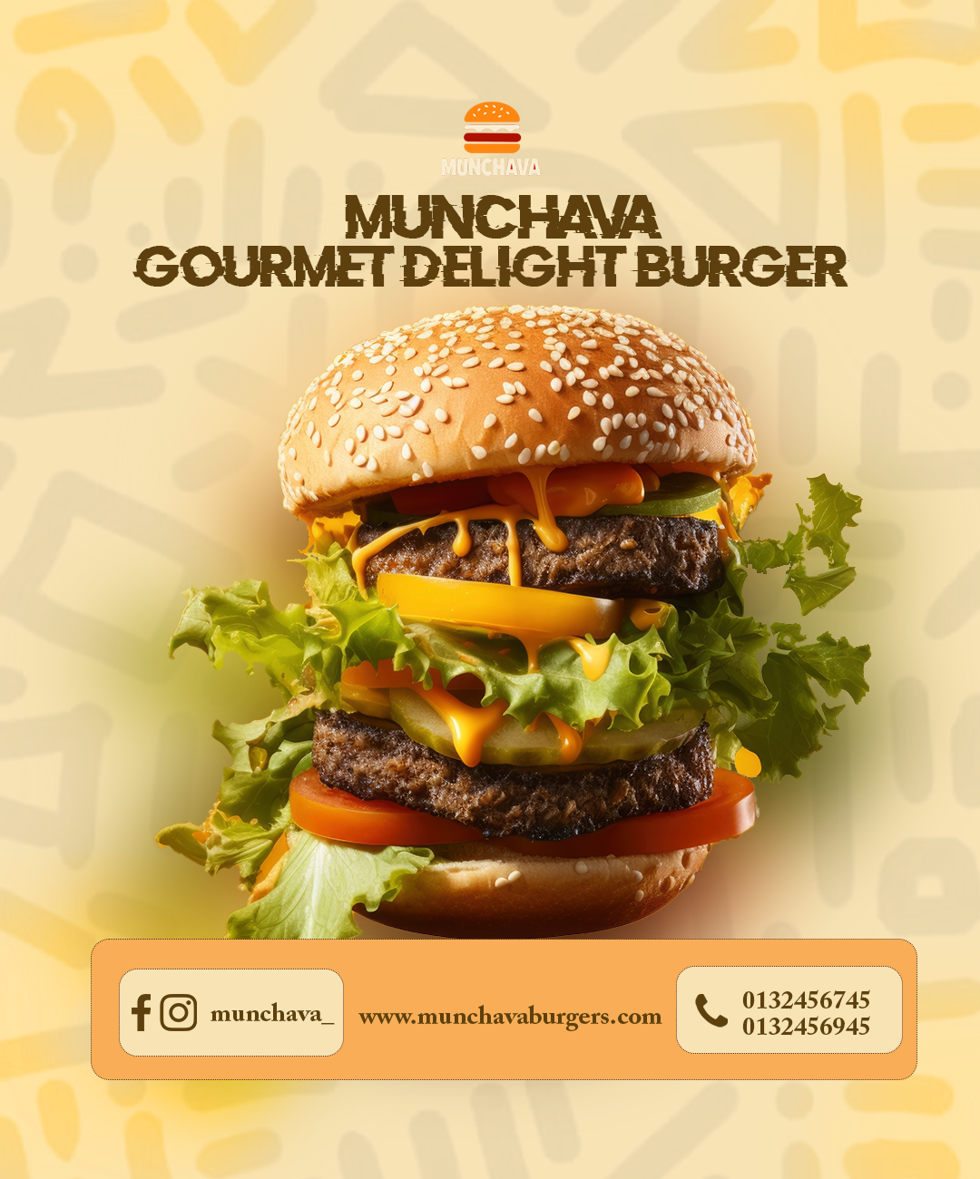
We developed a cohesive visual language that unified the various product lines while maintaining their individual identities. This involved creating a flexible typography system, a consistent colour palette, and a set of adaptable icons and graphics.
The outcome
The new visual identity has been successfully implemented across all touchpoints, resulting in a more cohesive brand presence and improved customer recognition.
Project gallery
Lets Work.
Lets create designs that are built to move people and made to last.
Start a project →